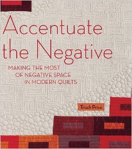
ACCENTUATE THE NEGATIVE: Making the most of Negative Space on Modern Quilts … by TRISCH PRICE …
.
.

.
.
I initially thought this book was about FREE MOTION QUILTING… but it is so much more! I goes into in depth explanation of using NEGATIVE SPACE effectively in your quilting. I highly recommend it to those quilters who want to study design for quilting.
.
.
I just got this book in the mail. I had a previewed it at a sew-in I went to earlier this month. I did not get the chance to read the entire book but I was enthralled by what I did read. Ms Price several different NEGATIVE SPACE DESIGN TECHNIQUES: Gradation, Reversal, Interruption, Negative Form, Ghosting, and Piecing. She supplies several quilts to demonstrate each of the techniques she explains. The picture of the quilts are great showing the entire quilt and close up of the free motion quilting. The quilts have a definite MODERN ascetic and some of the quilts are improvisational, while others are of a more defined pattern. Ms Price discusses how values and colors are used in modern quilting.
.
.
This is one of the first books about modern quilting where more than patterns are given. Ms Price’s book gives some of the first instructions in design principles of modern quilts. There might be other books out there that give instruction in modern design ascetic but I have not found one. Most of the books I have read are more pattern books without any in-depth design instruction. For the instruction in this book I can recommend it if you want to learn how apply the principles of design to modern quilts. I gave the book 4 stars in GoodReads but I will revisit my review per my habit after I have read thru it and apply what I learned.
.
.
I do have one major complaint about the book, but it is directed at the publisher and many of the other publishers that print their books with small, grey hard to read fonts. I resent that I have to use magnification to read a book… I feel they are trying to hide good information. I personally think that publishers have no consideration for their readers. They are trying so hard to be hip and trendy they forget to be considerate of their readers. I try to safe guard my vision after all I need it for quilting. AND Yes, I will be writing the publisher and tell them what I think of their publishing practices. After all this blog is about rants and raves!
.
.
Happy Quilting,
Nonnie
![]()
https://nonniequiltingdreams.wordpress.com/ Nonnie’s Blog
http://nonniesquiltingdreams.podbean.com/ Nonnie’s Quilting Dream Podcast
Links for Nonnie’s Quilting Dreams
FOLLOW ME ON TWITTER @NONNIE_P ….. @NONNIE_P
email me at: nonniequiltingdreams@gmail.com
.
.
.

Thank’s for the review, I will have to take a close look at this one.
Thank you. Appreciate your review
Nanettesturgill, I just took a look at your blog and it is really nice … I am going to add you to your blog reader. Thanks for dropping by. Nonnie
Thank you so much